The scatterplot above shows a set of data values as well as a trend line for the data. Based on the trend line, which of the following best describes the relationship between x and y?
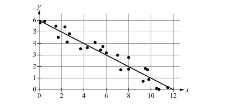
As x increases by 2, y tends to decrease by 1.
The trend line on the scatterplot indicates a negative slope, suggesting that as the values of x increase, the values of y decrease. The slope of the trend line specifically shows that for every increase of 2 units in x, y decreases by 1 unit.
This choice suggests a steep downward trend, indicating that y would significantly decrease with a small increase in x. However, the trend line reflects a more moderate slope, showing that y decreases less dramatically as x increases.
While this option proposes a decrease in y, it overestimates the rate of change. The slope of the trend line is not steep enough to support a decrease of 3 for an increase of 2 in x, indicating a more gradual decline in y.
This choice implies no relationship between x and y, suggesting that y does not change as x increases. The trend line clearly shows a negative correlation, indicating that y decreases as x increases, which contradicts this option.
This option describes a positive relationship, indicating that y would increase as x increases. The trend line, however, demonstrates a negative slope, making this choice incorrect as it misrepresents the direction of the relationship.
The relationship between x and y, as depicted by the trend line in the scatterplot, shows that y decreases as x increases. Specifically, for every increase of 2 in x, y decreases by 1. This understanding of the slope is crucial for interpreting data trends accurately, allowing for better predictions and analyses in statistical contexts.
Related Questions
View allDuring a 20% off sale, Mia spent a total of $80 on 4 books, and 3 of t...
The numbers shown above are the weights, in pounds, of 9 pumpkins sold...
What is the measure of the smaller angle formed by the hour hand and t...
Along a highway there is a post every 1/4 mile. Which of the following...
The price of a sailboat increased from $12000 to $15000. What was the...
Related Quizzes
View allPraxis 5001 Test with Answers
Praxis 5002 Study Guide
5002 Praxis Practice Test
Reading & Language Arts Praxis 5002
Praxis 5002 Reading and Language Arts Exam
Praxis 5003 Exam with Outline
5003 Praxis Math Answers
Praxis 5003 Study Guide
Praxis Social Studies 5004
Praxis 5004 Social Studies
- ✓ 500+ Practice Questions
- ✓ Detailed Explanations
- ✓ Progress Analytics
- ✓ Exam Simulations